fields.jsonファイルにフィールドを組み込み、テーマエディターとコンテンツエディターに変換します。
フィールドの作成と管理
モジュールのfields.jsonファイルには、HubSpot CLIを使用してローカル環境で、またはアプリ内のモジュールエディター上でフィールドを追加できます。テーマにフィールドを追加するには、CLIを使用してテーマのfields.jsonファイルをローカル環境で更新する必要があります。
HubSpot CLI
モジュールフィールドとテーマフィールドをローカル環境で構築する場合、モジュールまたはテーマのフォルダー内にあるfields.jsonファイル経由で編集できます。モジュールの場合、hs create moduleコマンドを使用すると、このファイルが自動作成されます。モジュールエディターで利用可能な全てのフィールドオプションは、fields.jsonファイルで追加または編集できるプロパティーとして使用できます。これには、リピーターフィールド、グループ、条件が含まれます。ローカル編集の利点の1つとして、gitのようなバージョン管理システムにモジュールを含めやすくなることが挙げられます。
モジュールエディター
デザインマネージャーには組み込みのモジュールエディターUIがあり、モジュールフィールドの作成、グループ化、編集に使用できます。モジュールエディターにはモジュールのプレビューがあるため、外観の確認とフィールドのテストが可能です。モジュールは何もないところでは動作しないので、必ず使用予定のテンプレートでテストし、テンプレートレベルのスタイルがモジュールにどのような影響を与えるかを確認する必要があります。なお、ロックされたフォルダーにモジュールが含まれている場合は、この方法で編集できないことに注意しましょう。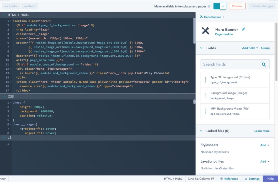
フィールドの横配置
デフォルトでは、コンテンツエディターでモジュールフィールドは縦方向に配置されます。ただし、fields.jsonファイルのフィールドにdisplay_widthプロパティーを追加し、値をhalf_widthに設定して、モジュールフィールドを横並びに配列することもできます。
display_widthをhalf_widthに設定した単一フィールドは、コンテンツエディターでは半分の幅で表示されます。fields.json内でこのフィールドの上または下にあるフィールドをhalf_widthに設定すると、フィールドが横並びに配置されます。
フィールドグループ
フィールドが互いに関連している場合、視覚的にグループ化することが適切な場合が少なくありません。これは、モジュールとテーマの両方でサポートされているフィールドグループを作成すれば実現できます。ローカルでフィールドグループを作成するには、fields.jsonで"group"というtypeのオブジェクトを作成します。次に、グループ化したいフィールドを格納するchildren配列を含めます。
childrenパラメーター内に別の"group"タイプのオブジェクトを追加することで、グループ内にさらにフィールドグループを作成できます。それから、上記と同じ方法でフィールドグループを構築し、childrenを使ってフィールドを格納します。フィールドグループは3レベルでネストできます。
フィールドグループの表示オプション
次のフィールドグループの表示動作をカスタマイズできます。- 展開: デフォルトでは、フィールドグループはエディター内で折りたたまれた状態で表示されます。ネストされたグループを含むグループはドリルダウンボタンとして表示され、独自のビューで開き、最も内側のグループには区切り線が表示されます。
- 表示タイプ: デフォルトでは、ネストされたグループを含まないグループは、子グループの周囲に視覚的な区切り線が付いた折りたたみ可能なセクションとして表示されます。ネストされたグループを含むグループはドリルダウンボタンとして表示され、独自のビューで開き、最も内側のグループは区切り線付きで表示されます。
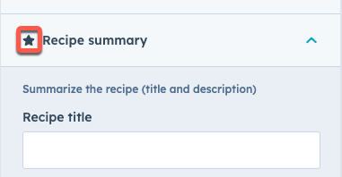
- グループアイコン: 必要に応じて、ラベルの左側に表示する「Font Awesome」アイコンを含めることができます。
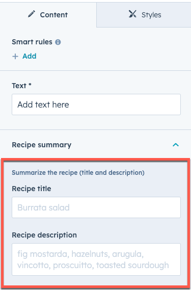
フィールドグループ内のフィールド値の出力
フィールドグループでは、出力するフィールド値を含むディクショナリー(辞書型)が作成されます。フィールドグループをネストした場合、ネストされたフィールドグループは外側のフィールド グループ ディクショナリー内にディクショナリーとして格納されます。このデータにアクセスするには、状況に応じてルートのテーマまたはモジュール変数からツリー内を走査する必要があります。フィールドグループの特集項目
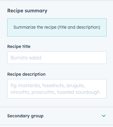
フィールドグループが繰り返される状況では、出現するフィールドグループのうち1つ以上をキービジュアル項目として指定できます。これにより、項目を個別にスタイル設定して目立たせることができます。例えば、強調表示したいおすすめの製品を表示する製品ページで特に便利です。 フィールドグループあたりの特集項目の最大数を指定できます。その後、制作担当者はエディターで必要に応じて項目を特集項目としてマークできます。.png)
group_occurrence_metaプロパティーを含めます。このプロパティーには次のプロパティーが格納されます。
featured_enabled:trueに設定すると、特集項目が有効になります。featured_limit:使用できる特集項目の最大数。
occurrenceプロパティーも含める必要があります。
hs_metaプロパティーを照会します。以下のコードでは、forループを使用して、特集項目に設定されているフィールドグループ項目を確認し、各項目のタイトルをh3ヘッダーとして表示しています。
{{ repeated_group_item.hs_meta.occurrence.featured }}
スタイルフィールド
スタイルフィールドは、モジュールまたはテーマのfields.jsonファイルの特殊なフィールド グループ タイプで、これによって制作担当者がモジュールやテーマのスタイルをページエディターとテーマエディター上で制御できるようになります。モジュールまたはテーマにスタイルフィールドを追加する方法を以下に示します。スタイルフィールドの使用と整理に関するベストプラクティスをご参照ください。
モジュールのスタイルフィールド
モジュールに追加したスタイルフィールドは、モジュール編集時のページエディターの[スタイル]タブに表示されます。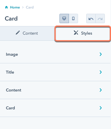
fields.jsonファイルに追加する場合は、全てのフィールドを1つのスタイルグループ内に追加します。ただし、次のようにこのグループ内に複数のグループを含めることができます。
fields.jsonファイル内のスタイルフィールドの例については、CMSボイラープレート(英語)をご参照ください。
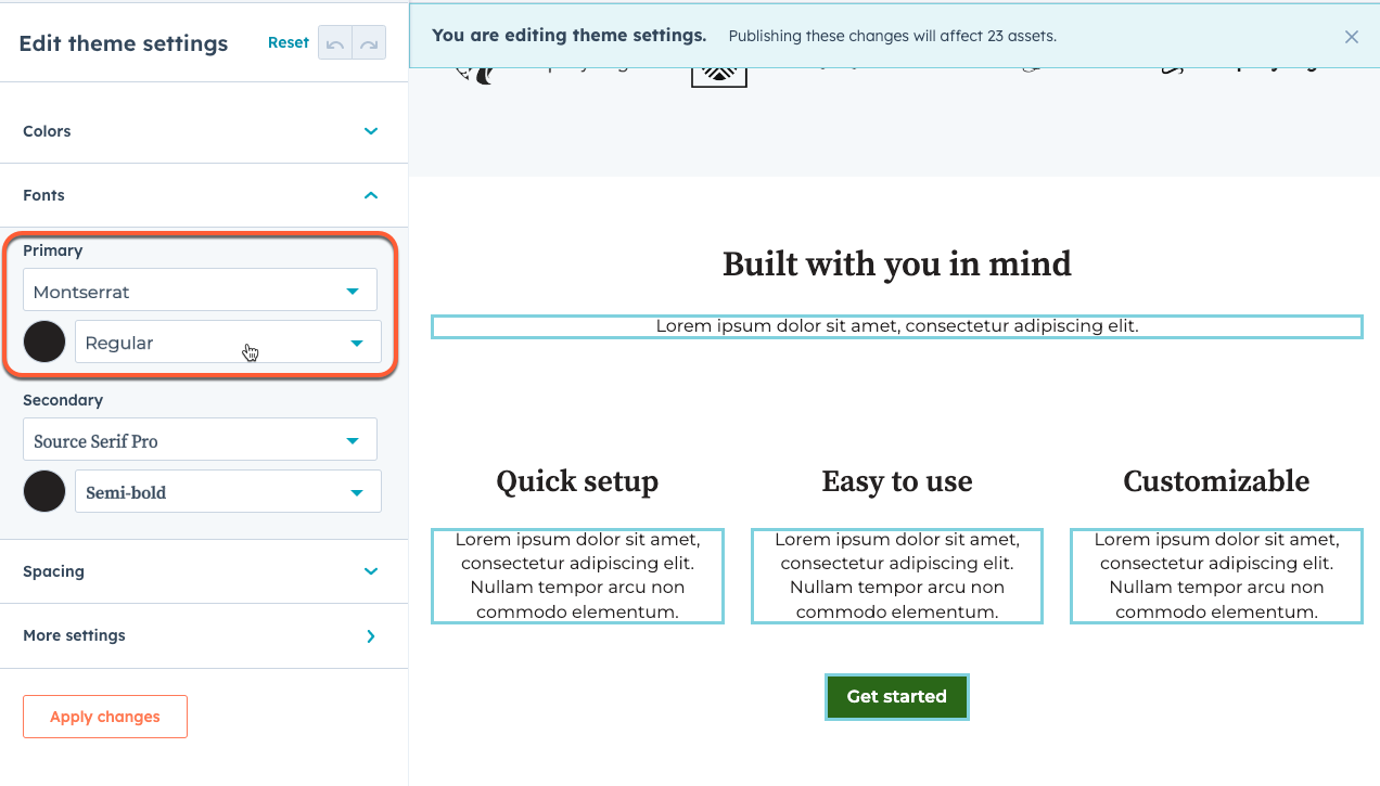
テーマのスタイルフィールド
テーマに追加したスタイルフィールドは、テーマエディターの左のサイドバーに表示されます。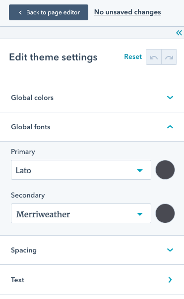
fields.jsonファイル内にある全てのスタイルフィールドは、テーマエディターの左のサイドバーに追加され、スタイルグループに追加する必要はありません。
fields.jsonファイル内のスタイルフィールドの例については、CMSボイラープレート(英語)をご参照ください。
生成されるCSS
一部のスタイルフィールドには、フィールドの値に基づいてCSSを直接出力する仕組みがあります。これは、グラデーションなどの複雑なスタイルを制御できるフィールドの場合に特に役立ちます。次のスタイルフィールドでは、生成された.cssプロパティーが使用されます。
リピーター
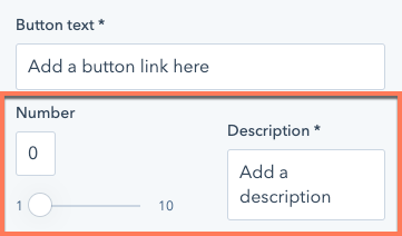
情報を形成するモジュールを作成する際には、繰り返し使用される情報があります。例えば、レシピモジュールに「材料」のフィールドがあるとします。ほとんどのレシピの材料は1つにとどまりません。リッチ テキスト フィールドを利用した場合、スタイルの一貫性を確保したり、材料別の機能を追加したりすることはできなくなります。このような状況ではリピーターが役に立ちます。HubSpotには繰り返しフィールドと繰り返しグループという2つの形式のリピーターがあります。繰り返しフィールド
これにより、制作担当者は必要な数の材料を追加できます。開発者の観点からは、ループ処理によって材料のリストを出力できる配列を使用して、必要な書式と機能を適用できます。 繰り返しフィールドは非常にシンプルな状況に最適です。一般的には、繰り返しグループが適切なケースが多くあります。Fields.json内の繰り返しフィールド
モジュールのHTML+HubLでの項目のループ
繰り返しグループ
ショッピングリストでは、材料の数量が重要です。数量がテキストフィールドに入力されると同時に、このモジュールがテキストフィールドを解析して、材料から数量が正常に分離されるようにする必要があります。そこで役立つのが、繰り返しグループです。こうしたフィールドの出力に対し、ループ処理を行うことができます。Fields.json内の繰り返しグループ
モジュール内の繰り返しフィールドのループ処理
リピーターオプション
継承フィールド
inherited_valueプロパティーは、他のフィールドからデフォルト値を継承するようにフィールドを設定できます。フィールドのデフォルト値全体を別のフィールド値から設定するには、default_value_pathにターゲットフィールドのフィールド名パスを指定します。default_value_pathを設定すると、フィールドに設定されたdefaultは全て無視されます。
他のフィールドの値にアクセスするには、モジュールのHubLコードでのアクセスと同様に、パスの先頭にmodule.を含める必要があります。
フォントファミリーは
fontとfont_setの組み合わせによって決まるため、フォントフィールドの継承にはこの両方を含める必要があります。詳しくはフォントフィールドをご確認ください。property_value_pathに継承するプロパティーを細かく指定できます。inherited_valueで参照されるパスにも、複雑なフィールドのフィールド値からのキーを含めることができます。
例えば、色フィールドには、色自体と不透明度を含むオブジェクト値があります。そのため、不透明度なしで色自体の値を取得するには、パスの末尾に.colorを指定します。例えばフォントフィールドは、個別の色フィールドから色だけを継承できます。
default_value_pathとproperty_value_pathsの効果を組み合わせて、あるフィールドからデフォルト値を継承しながら、別のフィールドから特定のプロパティー値を継承することもできます。
default_value_pathまたはproperty_value_pathsによって関連付けられた他のフィールドから影響を与えることはできなくなります。
フィールドの可視性
カスタムモジュールとテーマフィールドを定義する際に、fields.jsonファイル内のフィールドにvisibilityオブジェクトを追加することで、フィールドが表示される条件を構成できます。例えば、サンキューメッセージが選択されているときにはリッチテキスト領域を表示する一方で、リダイレクトが選択されているときはページセレクターを表示するようにフォームモジュールを設定できます。
表示条件はcontrolling_field_pathの値を基準に設定することも、propertyパラメーターを使用してフィールド内の特定のプロパティーを基準に設定することもできます。また、個々のフィールドに表示条件を適用したり、フィールドのグループに表示条件を適用して、そのグループ内の全ての要素の表示条件を管理したりすることもできます。
visibilityオブジェクト内にoccurrence_optionsオブジェクトを含めると、繰り返されるフィールドの値数をターゲットにすることもできます。このオブジェクトには、比較するcountとoperatorの定義を含める必要があります。例えば、別の繰り返しフィールドに少なくとも2つの項目がある場合にのみテキストフィールドを表示するには、visibilityを次のように定義します。
operaterの値を使用できます。
"NOT_EQUAL""EQUAL""EMPTY""NOT_EMPTY""GREATER_THAN""GREATER_THAN_OR_EQUAL""LESS_THAN""LESS_THAN_OR_EQUAL"
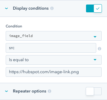
高度な可視性
visibility属性で同時に複数の条件をサポートすることはできません。複数の演算子を使用して複数の条件を追加し、演算の順序も指定するには、advanced_visibilityを使用します。
一例として、以下にデフォルトの支払いモジュールの最初の部分を記載します。完全なコードを確認するには、HubSpotでこのモジュールを複製してからローカル環境にダウンロードして、モジュールの
fields.jsonファイルを表示してください。
payment)は、コンテンツ制作担当者が特定の支払いリンクを作成するために使用する、必須のフィールド(ドロップダウンメニュー)です。HubSpotでは、コンテンツ制作担当者が最初にこのモジュールをページに追加すると、次のUIが表示されます。
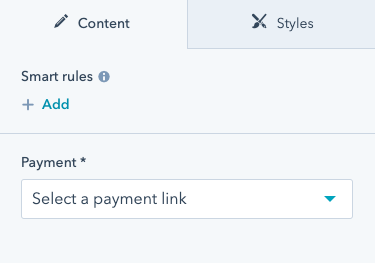
checkout_location、button_text、icon)が表示されます。このようになるのは、paymentフィールドによって制御され、paymentフィールドのidパラメーターのID値を必要とするvisibility属性が、これらのフィールドに設定されているためです。
iconフィールド自体はadvanced_visibilityを使用しており、paymentフィールドに支払いリンクが存在し、かつ、add_iconチェックボックスがオンにされている場合にのみ表示されます。
fields.json内で可視性を設定するだけでなく、デザインマネージャーでフィールドの「表示条件」オプションを編集して可視性を設定することもできます。
fields.jsonファイル内でvisibility属性を確認できます。
条件付きフィールドの無効化
フィールドに条件を追加して、指定された条件が満たされたときに編集不可にすることができます。フィールドを無効にした場合、コンテンツエディターでコンテキストを提供するために、フィールドの上に表示するメッセージを設定することもできます。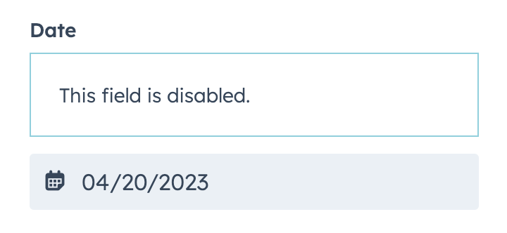
disabled_controlsオブジェクトで設定されます。フィールドを編集可能にするための条件は、rulesオブジェクト内で設定され、advanced_visibilityと同じ形式に従います。
以下のコードは、rules基準の単純な実装と高度な実装の両方を示しています。
simple_pageフィールドには、text_fieldがtestingに設定されている場合にフィールドを無効にするロジックが含まれています。fancy_pageフィールドには、text_fieldまたはtext_field_2のいずれかがそれぞれtestingとtesting2に等しくない値に設定されている場合にフィールドを無効にするロジックが含まれています。
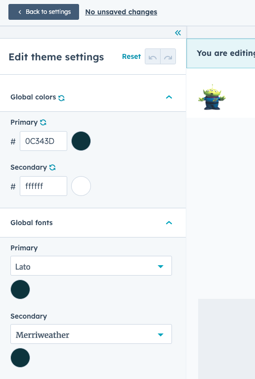
テーマ エディター フィールドのハイライト機能
テーマエディターでプレビューハイライト機能を使用すると、コンテンツ作成者が、どのフィールドがどのページ要素を制御しているかを理解するのに役立ちます。プレビューハイライト機能は、テーマフィールドをそのフィールドの影響を受けるCSSセレクターにマッピングすることによって機能します。テーマエディターでフィールドにカーソルを合わせると、そのフィールドがマッピングされている要素がボックスで囲んで表示されるという仕組みです。 テーマフィールドのプレビューハイライト機能を構成するには、テーマのルートディレクトリー内に、テーマフィールドとCSSセレクターのリストとのマッピングを指定するためのeditor-preview.jsonファイルを追加します。このファイルで、関連するCSSセレクターが含まれる、ハイライト表示する対象のスタイルフィールドごとに、次の形式を使用して配列を含めます。
editor-preview.jsonファイルでご確認ください。
このコマンドを実行した後、
editor-preview.jsonファイルを確認し、フィールドとセレクターが適切にマッピングされるように調整する必要があります。Generate-selectorsコマンドでは、どのフィールドがどのセレクターに影響するかについて基本的な推測が行われるだけなので、テーマがどのように作成されているかに基づいて修正する必要があります。例えばこのコマンドでは、モジュールがスタイル設定をオーバーライドしていたり、マクロが使用されたりしていても検出できません。
設定されているマッピングをテストするには、テーマをアカウントにアップロードし、そのアカウント内でテーマエディターを表示します([設定]>[ウェブサイト]>[テーマ]>[テーマを表示])。