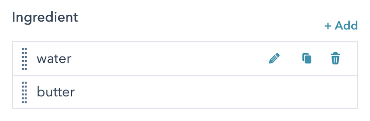
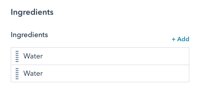
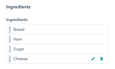
繰り返しフィールドは通常のフィールドですが、制作担当者がフィールドのインスタンスを追加、削除、再配置できます。上記のレシピモジュールの例では、各材料を繰り返しテキストフィールドにできます。
 この記事では、モジュールとテーマのフィールドのオプションを、作成および管理する方法を詳しく説明します。特定のフィールドタイプの詳細については、[モジュールとテーマのフィールドに関するリファレンスガイド](https://developers.hubspot.jp/docs/cms/reference/fields/module-theme-fields)をご覧ください。
## フィールドの作成と管理
[モジュール](https://developers.hubspot.jp/docs/cms/start-building/building-blocks/modules/overview)の`fields.json`ファイルには、[HubSpot CLI](/developer-tooling/local-development/hubspot-cli/reference)を使用してローカル環境で、またはアプリ内のモジュールエディター上でフィールドを追加できます。[テーマ](/cms/start-building/building-blocks/overview)にフィールドを追加するには、CLIを使用してテーマの`fields.json`ファイルをローカル環境で更新する必要があります。
### HubSpot CLI
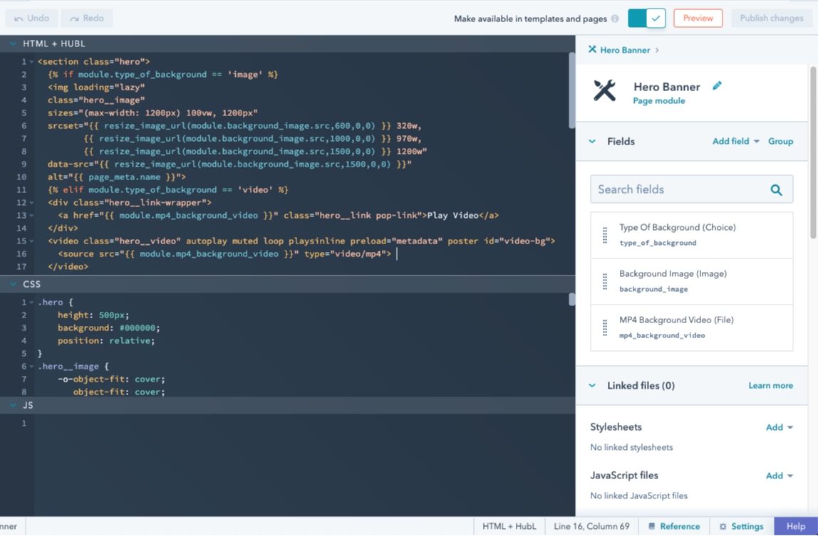
モジュールフィールドとテーマフィールドを[ローカル環境で構築](/developer-tooling/local-development/hubspot-cli/install-the-cli)する場合、モジュールまたはテーマのフォルダー内にある`fields.json`ファイル経由で編集できます。モジュールの場合、[`hs create module`](/developer-tooling/local-development/hubspot-cli/reference)コマンドを使用すると、このファイルが自動作成されます。モジュールエディターで利用可能な全てのフィールドオプションは、`fields.json`ファイルで追加または編集できるプロパティーとして使用できます。これには、リピーターフィールド、グループ、条件が含まれます。ローカル編集の利点の1つとして、[gitのようなバージョン管理システムにモジュールを含め](/cms/start-building/introduction/developer-environment/github-integration)やすくなることが挙げられます。
### モジュールエディター
[デザインマネージャー](/cms/start-building/introduction/developer-environment/design-manager)には組み込みのモジュールエディターUIがあり、モジュールフィールドの[作成](https://knowledge.hubspot.com/ja/design-manager/create-and-edit-modules)、グループ化、[編集](https://knowledge.hubspot.com/ja/design-manager/create-and-edit-modules)に使用できます。モジュールエディターにはモジュールのプレビューがあるため、外観の確認とフィールドのテストが可能です。モジュールは何もないところでは動作しないので、必ず使用予定のテンプレートでテストし、テンプレートレベルのスタイルがモジュールにどのような影響を与えるかを確認する必要があります。なお、ロックされたフォルダーにモジュールが含まれている場合は、この方法で編集できないことに注意しましょう。
この記事では、モジュールとテーマのフィールドのオプションを、作成および管理する方法を詳しく説明します。特定のフィールドタイプの詳細については、[モジュールとテーマのフィールドに関するリファレンスガイド](https://developers.hubspot.jp/docs/cms/reference/fields/module-theme-fields)をご覧ください。
## フィールドの作成と管理
[モジュール](https://developers.hubspot.jp/docs/cms/start-building/building-blocks/modules/overview)の`fields.json`ファイルには、[HubSpot CLI](/developer-tooling/local-development/hubspot-cli/reference)を使用してローカル環境で、またはアプリ内のモジュールエディター上でフィールドを追加できます。[テーマ](/cms/start-building/building-blocks/overview)にフィールドを追加するには、CLIを使用してテーマの`fields.json`ファイルをローカル環境で更新する必要があります。
### HubSpot CLI
モジュールフィールドとテーマフィールドを[ローカル環境で構築](/developer-tooling/local-development/hubspot-cli/install-the-cli)する場合、モジュールまたはテーマのフォルダー内にある`fields.json`ファイル経由で編集できます。モジュールの場合、[`hs create module`](/developer-tooling/local-development/hubspot-cli/reference)コマンドを使用すると、このファイルが自動作成されます。モジュールエディターで利用可能な全てのフィールドオプションは、`fields.json`ファイルで追加または編集できるプロパティーとして使用できます。これには、リピーターフィールド、グループ、条件が含まれます。ローカル編集の利点の1つとして、[gitのようなバージョン管理システムにモジュールを含め](/cms/start-building/introduction/developer-environment/github-integration)やすくなることが挙げられます。
### モジュールエディター
[デザインマネージャー](/cms/start-building/introduction/developer-environment/design-manager)には組み込みのモジュールエディターUIがあり、モジュールフィールドの[作成](https://knowledge.hubspot.com/ja/design-manager/create-and-edit-modules)、グループ化、[編集](https://knowledge.hubspot.com/ja/design-manager/create-and-edit-modules)に使用できます。モジュールエディターにはモジュールのプレビューがあるため、外観の確認とフィールドのテストが可能です。モジュールは何もないところでは動作しないので、必ず使用予定のテンプレートでテストし、テンプレートレベルのスタイルがモジュールにどのような影響を与えるかを確認する必要があります。なお、ロックされたフォルダーにモジュールが含まれている場合は、この方法で編集できないことに注意しましょう。
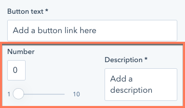 `display_width`を`half_width`に設定した単一フィールドは、コンテンツエディターでは半分の幅で表示されます。`fields.json`内でこのフィールドの上または下にあるフィールドを`half_width`に設定すると、フィールドが横並びに配置されます。
```json theme={null}
// Example module fields.json file
[
{
"name": "number_field",
"label": "Number",
"required": false,
"locked": false,
"display": "slider",
"min": 1,
"max": 10,
"step": 1,
"type": "number",
"prefix": "",
"suffix": "",
"default": null,
"display_width": "half_width"
},
{
"label": "Description",
"name": "description",
"type": "text",
"required": true,
"default": "Add a description",
"display_width": "half_width"
}
]
```
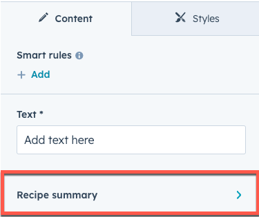
## フィールドグループ
フィールドが互いに関連している場合、視覚的にグループ化することが適切な場合が少なくありません。これは、モジュールとテーマの両方でサポートされているフィールドグループを作成すれば実現できます。ローカルでフィールドグループを作成するには、`fields.json`で`"group"`という`type`のオブジェクトを作成します。次に、グループ化したいフィールドを格納する`children`配列を含めます。
`display_width`を`half_width`に設定した単一フィールドは、コンテンツエディターでは半分の幅で表示されます。`fields.json`内でこのフィールドの上または下にあるフィールドを`half_width`に設定すると、フィールドが横並びに配置されます。
```json theme={null}
// Example module fields.json file
[
{
"name": "number_field",
"label": "Number",
"required": false,
"locked": false,
"display": "slider",
"min": 1,
"max": 10,
"step": 1,
"type": "number",
"prefix": "",
"suffix": "",
"default": null,
"display_width": "half_width"
},
{
"label": "Description",
"name": "description",
"type": "text",
"required": true,
"default": "Add a description",
"display_width": "half_width"
}
]
```
## フィールドグループ
フィールドが互いに関連している場合、視覚的にグループ化することが適切な場合が少なくありません。これは、モジュールとテーマの両方でサポートされているフィールドグループを作成すれば実現できます。ローカルでフィールドグループを作成するには、`fields.json`で`"group"`という`type`のオブジェクトを作成します。次に、グループ化したいフィールドを格納する`children`配列を含めます。
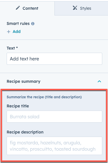 ```json theme={null}
[
{
"id": "9c00985f-01db-ac5d-73f5-80ed6c0c7863",
"name": "my_text",
"display_width": null,
"label": "Text",
"required": true,
"locked": false,
"validation_regex": "",
"allow_new_line": false,
"show_emoji_picker": false,
"type": "text",
"default": "Add text here"
},
{
"type": "group",
"name": "recipe_summary_group",
"label": "Recipe summary",
"expanded": true,
"inline_help_text": "Summarize the recipe (title and description)",
"children": [
{
"type": "text",
"label": "Recipe title",
"name": "recipe_title",
"placeholder": "Burrata salad"
},
{
"type": "text",
"label": "Recipe description",
"name": "recipe_description",
"placeholder": "fig mostarda, hazelnuts, arugula, vincotto, prosciutto, toasted sourdough"
}
]
}
]
```
最初の`children`パラメーター内に別の`"group"`タイプのオブジェクトを追加することで、グループ内にさらにフィールドグループを作成できます。それから、上記と同じ方法でフィールドグループを構築し、`children`を使ってフィールドを格納します。フィールドグループは3レベルでネストできます。
```json theme={null}
[
{
"id": "9c00985f-01db-ac5d-73f5-80ed6c0c7863",
"name": "my_text",
"display_width": null,
"label": "Text",
"required": true,
"locked": false,
"validation_regex": "",
"allow_new_line": false,
"show_emoji_picker": false,
"type": "text",
"default": "Add text here"
},
{
"type": "group",
"name": "recipe_summary_group",
"label": "Recipe summary",
"expanded": true,
"inline_help_text": "Summarize the recipe (title and description)",
"children": [
{
"type": "text",
"label": "Recipe title",
"name": "recipe_title",
"placeholder": "Burrata salad"
},
{
"type": "text",
"label": "Recipe description",
"name": "recipe_description",
"placeholder": "fig mostarda, hazelnuts, arugula, vincotto, prosciutto, toasted sourdough"
}
]
}
]
```
最初の`children`パラメーター内に別の`"group"`タイプのオブジェクトを追加することで、グループ内にさらにフィールドグループを作成できます。それから、上記と同じ方法でフィールドグループを構築し、`children`を使ってフィールドを格納します。フィールドグループは3レベルでネストできます。
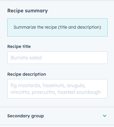 ```json theme={null}
[
{
"type": "group",
"name": "recipe_summary_group",
"label": "Recipe summary",
"inline_help_text": "Summarize the recipe (title and description)",
"display": "inline",
"children": [
{
"type": "text",
"label": "Recipe title",
"name": "recipe_title",
"placeholder": "Burrata salad"
},
{
"type": "text",
"label": "Recipe description",
"name": "recipe_description",
"placeholder": "fig mostarda, hazelnuts, arugula, vincotto, prosciutto, toasted sourdough"
},
{
"type": "group",
"name": "secondary_group",
"label": "Secondary group",
"expanded": false,
"children": [
{
"name": "bg_color",
"label": "Background color",
"sortable": false,
"required": false,
"locked": false,
"type": "color",
"default": {
"color": "#ff0000",
"opacity": 100
}
}
]
}
]
}
]
```
#### フィールドグループの表示オプション
次のフィールドグループの表示動作をカスタマイズできます。
* **展開**: デフォルトでは、フィールドグループはエディター内で折りたたまれた状態で表示されます。ネストされたグループを含むグループはドリルダウンボタンとして表示され、独自のビューで開き、最も内側のグループには区切り線が表示されます。
```json theme={null}
[
{
"type": "group",
"name": "recipe_summary_group",
"label": "Recipe summary",
"inline_help_text": "Summarize the recipe (title and description)",
"display": "inline",
"children": [
{
"type": "text",
"label": "Recipe title",
"name": "recipe_title",
"placeholder": "Burrata salad"
},
{
"type": "text",
"label": "Recipe description",
"name": "recipe_description",
"placeholder": "fig mostarda, hazelnuts, arugula, vincotto, prosciutto, toasted sourdough"
},
{
"type": "group",
"name": "secondary_group",
"label": "Secondary group",
"expanded": false,
"children": [
{
"name": "bg_color",
"label": "Background color",
"sortable": false,
"required": false,
"locked": false,
"type": "color",
"default": {
"color": "#ff0000",
"opacity": 100
}
}
]
}
]
}
]
```
#### フィールドグループの表示オプション
次のフィールドグループの表示動作をカスタマイズできます。
* **展開**: デフォルトでは、フィールドグループはエディター内で折りたたまれた状態で表示されます。ネストされたグループを含むグループはドリルダウンボタンとして表示され、独自のビューで開き、最も内側のグループには区切り線が表示されます。
 * **表示タイプ**: デフォルトでは、ネストされたグループを含まないグループは、子グループの周囲に視覚的な区切り線が付いた折りたたみ可能なセクションとして表示されます。ネストされたグループを含むグループはドリルダウンボタンとして表示され、独自のビューで開き、最も内側のグループは区切り線付きで表示されます。
* **グループアイコン**: 必要に応じて、ラベルの左側に表示する「Font Awesome」アイコンを含めることができます。
* **表示タイプ**: デフォルトでは、ネストされたグループを含まないグループは、子グループの周囲に視覚的な区切り線が付いた折りたたみ可能なセクションとして表示されます。ネストされたグループを含むグループはドリルダウンボタンとして表示され、独自のビューで開き、最も内側のグループは区切り線付きで表示されます。
* **グループアイコン**: 必要に応じて、ラベルの左側に表示する「Font Awesome」アイコンを含めることができます。
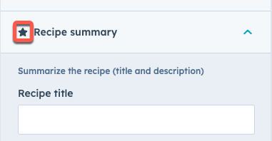 ```json theme={null}
[
{
"type": "group",
"name": "recipe_summary_group",
"label": "Recipe summary",
"display": "drilldown",
"inline_help_text": "Summarize the recipe (title and description)",
"icon": {
"name": "star",
"set": "fontawesome-5.14.0",
"type": "SOLID"
},
"children": [
{
"type": "text",
"label": "Recipe title",
"name": "recipe_title",
"placeholder": "Burrata salad"
},
{
"type": "text",
"label": "Recipe description",
"name": "recipe_description",
"placeholder": "fig mostarda, hazelnuts, arugula, vincotto, prosciutto, toasted sourdough"
}
]
}
]
```
| パラメーター | タイプ | 説明 |
| ---------- | ------ | ------------------------------------------------------------------------------------------------------------------------------------------------------------------------------------------------------------------------------------------------------------------------------------------------------- |
| `display` | 文字列 | フィールドグループの表示スタイル。次のいずれかになります。
```json theme={null}
[
{
"type": "group",
"name": "recipe_summary_group",
"label": "Recipe summary",
"display": "drilldown",
"inline_help_text": "Summarize the recipe (title and description)",
"icon": {
"name": "star",
"set": "fontawesome-5.14.0",
"type": "SOLID"
},
"children": [
{
"type": "text",
"label": "Recipe title",
"name": "recipe_title",
"placeholder": "Burrata salad"
},
{
"type": "text",
"label": "Recipe description",
"name": "recipe_description",
"placeholder": "fig mostarda, hazelnuts, arugula, vincotto, prosciutto, toasted sourdough"
}
]
}
]
```
| パラメーター | タイプ | 説明 |
| ---------- | ------ | ------------------------------------------------------------------------------------------------------------------------------------------------------------------------------------------------------------------------------------------------------------------------------------------------------- |
| `display` | 文字列 | フィールドグループの表示スタイル。次のいずれかになります。.png) )
フィールドグループ内で特集項目を有効にするには、フィールドグループの設定に`group_occurrence_meta`プロパティーを含めます。このプロパティーには次のプロパティーが格納されます。
* `featured_enabled`:`true`に設定すると、特集項目が有効になります。
* `featured_limit`:使用できる特集項目の最大数。
フィールドグループには`occurrence`プロパティーも含める必要があります。
```json theme={null}
// Field group example
{
"label": "Card",
"name": "card",
"type": "group",
"occurrence": {
"default": 2,
"min": 1,
"sorting_label_field": "card.title"
},
"group_occurrence_meta": {
"featured_enabled": true,
"featured_limit": 3
},
"children": [
{
"label": "Image",
"name": "image",
"type": "image",
"responsive": true,
"resizable": true,
"show_loading": true,
"default": {
"loading": "lazy"
}
},
{
"label": "Content",
"name": "text",
"type": "richtext",
"enabled_features": [
"advanced_emphasis",
"alignment",
"block",
"emoji",
"font_family",
"font_size",
"lists",
"standard_emphasis"
],
"default": "
)
フィールドグループ内で特集項目を有効にするには、フィールドグループの設定に`group_occurrence_meta`プロパティーを含めます。このプロパティーには次のプロパティーが格納されます。
* `featured_enabled`:`true`に設定すると、特集項目が有効になります。
* `featured_limit`:使用できる特集項目の最大数。
フィールドグループには`occurrence`プロパティーも含める必要があります。
```json theme={null}
// Field group example
{
"label": "Card",
"name": "card",
"type": "group",
"occurrence": {
"default": 2,
"min": 1,
"sorting_label_field": "card.title"
},
"group_occurrence_meta": {
"featured_enabled": true,
"featured_limit": 3
},
"children": [
{
"label": "Image",
"name": "image",
"type": "image",
"responsive": true,
"resizable": true,
"show_loading": true,
"default": {
"loading": "lazy"
}
},
{
"label": "Content",
"name": "text",
"type": "richtext",
"enabled_features": [
"advanced_emphasis",
"alignment",
"block",
"emoji",
"font_family",
"font_size",
"lists",
"standard_emphasis"
],
"default": "Contextual advertising can be profitable. It can either pay for your hosting and maintenance costs for you website or it can pay for a lot more.
" } ], "default": [ { "image": { "loading": "lazy" }, "text": "Contextual advertising can be profitable. It can either pay for your hosting and maintenance costs for you website or it can pay for a lot more.
" }, { "image": { "loading": "lazy" }, "text": "Contextual advertising can be profitable. It can either pay for your hosting and maintenance costs for you website or it can pay for a lot more.
" } ] } ``` 繰り返しグループ内の項目がキービジュアルであるかどうかを確認するには、`hs_meta`プロパティーを照会します。以下のコードでは、[forループ](https://developers.hubspot.jp/docs/cms/reference/hubl/loops)を使用して、特集項目に設定されているフィールドグループ項目を確認し、各項目のタイトルを`h3`ヘッダーとして表示しています。 `{{ repeated_group_item.hs_meta.occurrence.featured }}` ```hubl theme={null}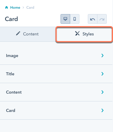 スタイルフィールドをモジュールの`fields.json`ファイルに追加する場合は、全てのフィールドを1つのスタイルグループ内に追加します。ただし、次のようにこのグループ内に複数のグループを含めることができます。
```json theme={null}
// Module style fields
[
{
"type": "group",
"name": "styles",
"tab": "STYLE",
"children": [
{
"name": "img_spacing",
"label": "Spacing around image",
"required": false,
"type": "spacing",
"default": {
"padding": {
"top": {
"value": 10,
"units": "px"
},
"bottom": {
"value": 10,
"units": "px"
},
"left": {
"value": 10,
"units": "px"
},
"right": {
"value": 10,
"units": "px"
}
},
"margin": {
"top": {
"value": 10,
"units": "px"
},
"bottom": {
"value": 10,
"units": "px"
}
}
}
}
]
}
]
```
モジュールのスタイルフィールドとして使用できるフィールドを以下に示します。各フィールドタイプについては、[モジュールとフィールドタイプのガイド](https://developers.hubspot.jp/docs/cms/reference/fields/module-theme-fields)をご確認ください。
* [位置合わせ](https://developers.hubspot.jp/docs/cms/reference/fields/module-theme-fields#alignment)
* [グラデーション](https://developers.hubspot.jp/docs/cms/reference/fields/module-theme-fields#gradient)
* [間隔](https://developers.hubspot.jp/docs/cms/reference/fields/module-theme-fields#spacing)
* [背景画像](https://developers.hubspot.jp/docs/cms/reference/fields/module-theme-fields#background-image)
* [境界線](https://developers.hubspot.jp/docs/cms/reference/fields/module-theme-fields#border)
* [ブール値](https://developers.hubspot.jp/docs/cms/reference/fields/module-theme-fields#boolean)
* [選択](https://developers.hubspot.jp/docs/cms/reference/fields/module-theme-fields#choice)
* [数値](https://developers.hubspot.jp/docs/cms/reference/fields/module-theme-fields#number)
* [カラー](https://developers.hubspot.jp/docs/cms/reference/fields/module-theme-fields#color)
* [アイコン](https://developers.hubspot.jp/docs/cms/reference/fields/module-theme-fields#icon)
* [画像](https://developers.hubspot.jp/docs/cms/reference/fields/module-theme-fields#image)
* [フォント](https://developers.hubspot.jp/docs/cms/reference/fields/module-theme-fields#font)
* [テキストの位置合わせ](https://developers.hubspot.jp/docs/cms/reference/fields/module-theme-fields#text-alignment)
詳しくは[モジュールとテーマのフィールドタイプ](https://developers.hubspot.jp/docs/cms/reference/fields/module-theme-fields)をご覧ください。
モジュールの`fields.json`ファイル内のスタイルフィールドの例については、[CMSボイラープレート](https://github.com/HubSpot/cms-theme-boilerplate/blob/main/src/modules/card.module/fields.json)(英語)をご参照ください。
### テーマのスタイルフィールド
テーマに追加したスタイルフィールドは、テーマエディターの左のサイドバーに表示されます。
スタイルフィールドをモジュールの`fields.json`ファイルに追加する場合は、全てのフィールドを1つのスタイルグループ内に追加します。ただし、次のようにこのグループ内に複数のグループを含めることができます。
```json theme={null}
// Module style fields
[
{
"type": "group",
"name": "styles",
"tab": "STYLE",
"children": [
{
"name": "img_spacing",
"label": "Spacing around image",
"required": false,
"type": "spacing",
"default": {
"padding": {
"top": {
"value": 10,
"units": "px"
},
"bottom": {
"value": 10,
"units": "px"
},
"left": {
"value": 10,
"units": "px"
},
"right": {
"value": 10,
"units": "px"
}
},
"margin": {
"top": {
"value": 10,
"units": "px"
},
"bottom": {
"value": 10,
"units": "px"
}
}
}
}
]
}
]
```
モジュールのスタイルフィールドとして使用できるフィールドを以下に示します。各フィールドタイプについては、[モジュールとフィールドタイプのガイド](https://developers.hubspot.jp/docs/cms/reference/fields/module-theme-fields)をご確認ください。
* [位置合わせ](https://developers.hubspot.jp/docs/cms/reference/fields/module-theme-fields#alignment)
* [グラデーション](https://developers.hubspot.jp/docs/cms/reference/fields/module-theme-fields#gradient)
* [間隔](https://developers.hubspot.jp/docs/cms/reference/fields/module-theme-fields#spacing)
* [背景画像](https://developers.hubspot.jp/docs/cms/reference/fields/module-theme-fields#background-image)
* [境界線](https://developers.hubspot.jp/docs/cms/reference/fields/module-theme-fields#border)
* [ブール値](https://developers.hubspot.jp/docs/cms/reference/fields/module-theme-fields#boolean)
* [選択](https://developers.hubspot.jp/docs/cms/reference/fields/module-theme-fields#choice)
* [数値](https://developers.hubspot.jp/docs/cms/reference/fields/module-theme-fields#number)
* [カラー](https://developers.hubspot.jp/docs/cms/reference/fields/module-theme-fields#color)
* [アイコン](https://developers.hubspot.jp/docs/cms/reference/fields/module-theme-fields#icon)
* [画像](https://developers.hubspot.jp/docs/cms/reference/fields/module-theme-fields#image)
* [フォント](https://developers.hubspot.jp/docs/cms/reference/fields/module-theme-fields#font)
* [テキストの位置合わせ](https://developers.hubspot.jp/docs/cms/reference/fields/module-theme-fields#text-alignment)
詳しくは[モジュールとテーマのフィールドタイプ](https://developers.hubspot.jp/docs/cms/reference/fields/module-theme-fields)をご覧ください。
モジュールの`fields.json`ファイル内のスタイルフィールドの例については、[CMSボイラープレート](https://github.com/HubSpot/cms-theme-boilerplate/blob/main/src/modules/card.module/fields.json)(英語)をご参照ください。
### テーマのスタイルフィールド
テーマに追加したスタイルフィールドは、テーマエディターの左のサイドバーに表示されます。
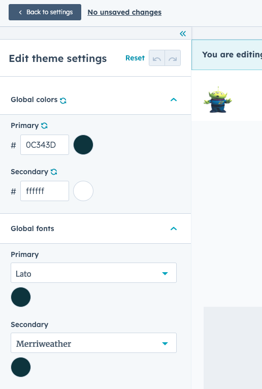
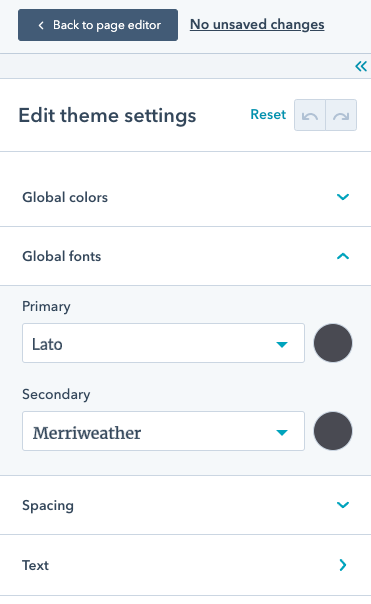 以下のように、テーマの`fields.json`ファイル内にある全てのスタイルフィールドは、テーマエディターの左のサイドバーに追加され、スタイルグループに追加する必要はありません。
```json theme={null}
// Theme style fields
[
{
"label": "Global colors",
"name": "global_colors",
"type": "group",
"children": [
{
"label": "Primary",
"name": "primary",
"type": "color",
"visibility": {
"hidden_subfields": {
"opacity": true
}
},
"default": {
"color": "#494A52"
}
},
{
"label": "Secondary",
"name": "secondary",
"type": "color",
"visibility": {
"hidden_subfields": {
"opacity": true
}
},
"default": {
"color": "#F8FAFC"
}
}
]
},
{
"label": "Global fonts",
"name": "global_fonts",
"type": "group",
"children": [
{
"label": "Primary",
"name": "primary",
"type": "font",
"visibility": {
"hidden_subfields": {
"size": true,
"styles": true
}
},
"inherited_value": {
"property_value_paths": {
"color": "theme.global_colors.primary.color"
}
},
"default": {
"fallback": "sans-serif",
"font": "Lato",
"font_set": "GOOGLE"
}
},
{
"label": "Secondary",
"name": "secondary",
"type": "font",
"visibility": {
"hidden_subfields": {
"size": true,
"styles": true
}
},
"inherited_value": {
"property_value_paths": {
"color": "theme.global_colors.primary.color"
}
},
"default": {
"fallback": "serif",
"font": "Merriweather",
"font_set": "GOOGLE"
}
}
]
},
{
"name": "branding_color",
"label": "branding_color",
"type": "color",
"default": {
"color": "#3b7bc0", "opacity": 60
},
"inherited_value": {
"property_value_paths": {
"color": "brand_settings.primaryColor"
}
}
},
{
"name": "secondary_branding_color",
"label": "Secondary Branding color",
"type": "color",
"default": {
"color": "#ff6b6b", "opacity": 60
},
"inherited_value": {
"property_value_paths": {
"color": "brand_settings.colors[2]"
}
}
}
]
}
]
```
テーマのスタイルフィールドとして使用できるフィールドを以下に示します。各フィールドタイプについては、[モジュールとフィールドタイプのガイド](https://developers.hubspot.jp/docs/cms/reference/fields/module-theme-fields)をご確認ください。
* [ブール値](https://developers.hubspot.jp/docs/cms/reference/fields/module-theme-fields#boolean)
* [境界線](https://developers.hubspot.jp/docs/cms/reference/fields/module-theme-fields#border)
* [選択](https://developers.hubspot.jp/docs/cms/reference/fields/module-theme-fields#choice)
* [カラー](https://developers.hubspot.jp/docs/cms/reference/fields/module-theme-fields#color)
* [フォント](https://developers.hubspot.jp/docs/cms/reference/fields/module-theme-fields#font)
* [画像](https://developers.hubspot.jp/docs/cms/reference/fields/module-theme-fields#image)
* [数値](https://developers.hubspot.jp/docs/cms/reference/fields/module-theme-fields#number)
* [間隔](https://developers.hubspot.jp/docs/cms/reference/fields/module-theme-fields#spacing)
詳しくは[モジュールとテーマのフィールドタイプ](https://developers.hubspot.jp/docs/cms/reference/fields/module-theme-fields)をご覧ください。
テーマの`fields.json`ファイル内のスタイルフィールドの例については、[CMSボイラープレート](https://github.com/HubSpot/cms-theme-boilerplate/blob/main/src/fields.json)(英語)をご参照ください。
以下のように、テーマの`fields.json`ファイル内にある全てのスタイルフィールドは、テーマエディターの左のサイドバーに追加され、スタイルグループに追加する必要はありません。
```json theme={null}
// Theme style fields
[
{
"label": "Global colors",
"name": "global_colors",
"type": "group",
"children": [
{
"label": "Primary",
"name": "primary",
"type": "color",
"visibility": {
"hidden_subfields": {
"opacity": true
}
},
"default": {
"color": "#494A52"
}
},
{
"label": "Secondary",
"name": "secondary",
"type": "color",
"visibility": {
"hidden_subfields": {
"opacity": true
}
},
"default": {
"color": "#F8FAFC"
}
}
]
},
{
"label": "Global fonts",
"name": "global_fonts",
"type": "group",
"children": [
{
"label": "Primary",
"name": "primary",
"type": "font",
"visibility": {
"hidden_subfields": {
"size": true,
"styles": true
}
},
"inherited_value": {
"property_value_paths": {
"color": "theme.global_colors.primary.color"
}
},
"default": {
"fallback": "sans-serif",
"font": "Lato",
"font_set": "GOOGLE"
}
},
{
"label": "Secondary",
"name": "secondary",
"type": "font",
"visibility": {
"hidden_subfields": {
"size": true,
"styles": true
}
},
"inherited_value": {
"property_value_paths": {
"color": "theme.global_colors.primary.color"
}
},
"default": {
"fallback": "serif",
"font": "Merriweather",
"font_set": "GOOGLE"
}
}
]
},
{
"name": "branding_color",
"label": "branding_color",
"type": "color",
"default": {
"color": "#3b7bc0", "opacity": 60
},
"inherited_value": {
"property_value_paths": {
"color": "brand_settings.primaryColor"
}
}
},
{
"name": "secondary_branding_color",
"label": "Secondary Branding color",
"type": "color",
"default": {
"color": "#ff6b6b", "opacity": 60
},
"inherited_value": {
"property_value_paths": {
"color": "brand_settings.colors[2]"
}
}
}
]
}
]
```
テーマのスタイルフィールドとして使用できるフィールドを以下に示します。各フィールドタイプについては、[モジュールとフィールドタイプのガイド](https://developers.hubspot.jp/docs/cms/reference/fields/module-theme-fields)をご確認ください。
* [ブール値](https://developers.hubspot.jp/docs/cms/reference/fields/module-theme-fields#boolean)
* [境界線](https://developers.hubspot.jp/docs/cms/reference/fields/module-theme-fields#border)
* [選択](https://developers.hubspot.jp/docs/cms/reference/fields/module-theme-fields#choice)
* [カラー](https://developers.hubspot.jp/docs/cms/reference/fields/module-theme-fields#color)
* [フォント](https://developers.hubspot.jp/docs/cms/reference/fields/module-theme-fields#font)
* [画像](https://developers.hubspot.jp/docs/cms/reference/fields/module-theme-fields#image)
* [数値](https://developers.hubspot.jp/docs/cms/reference/fields/module-theme-fields#number)
* [間隔](https://developers.hubspot.jp/docs/cms/reference/fields/module-theme-fields#spacing)
詳しくは[モジュールとテーマのフィールドタイプ](https://developers.hubspot.jp/docs/cms/reference/fields/module-theme-fields)をご覧ください。
テーマの`fields.json`ファイル内のスタイルフィールドの例については、[CMSボイラープレート](https://github.com/HubSpot/cms-theme-boilerplate/blob/main/src/fields.json)(英語)をご参照ください。
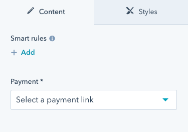 支払いリンクを選択すると、上記のUIの後に続いて3つのフィールド(`checkout_location`、`button_text`、`icon`)が表示されます。このようになるのは、`payment`フィールドによって制御され、paymentフィールドの`id`パラメーターのID値を必要とする`visibility`属性が、これらのフィールドに設定されているためです。
`icon`フィールド自体は`advanced_visibility`を使用しており、`payment`フィールドに支払いリンクが存在し、かつ、`add_icon`チェックボックスがオンにされている場合にのみ表示されます。
`fields.json`内で可視性を設定するだけでなく、デザインマネージャーでフィールドの「表示条件」オプションを編集して可視性を設定することもできます。
支払いリンクを選択すると、上記のUIの後に続いて3つのフィールド(`checkout_location`、`button_text`、`icon`)が表示されます。このようになるのは、`payment`フィールドによって制御され、paymentフィールドの`id`パラメーターのID値を必要とする`visibility`属性が、これらのフィールドに設定されているためです。
`icon`フィールド自体は`advanced_visibility`を使用しており、`payment`フィールドに支払いリンクが存在し、かつ、`add_icon`チェックボックスがオンにされている場合にのみ表示されます。
`fields.json`内で可視性を設定するだけでなく、デザインマネージャーでフィールドの「表示条件」オプションを編集して可視性を設定することもできます。
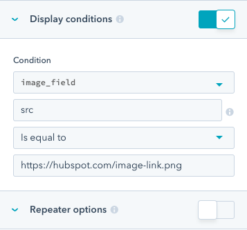 デザインマネージャーで表示条件を設定した後は、[CLIを使用](/developer-tooling/local-development/hubspot-cli/reference#fetch)してこのモジュールを[フェッチ](/developer-tooling/local-development/hubspot-cli/install-the-cli)し、モジュールの`fields.json`ファイル内で`visibility`属性を確認できます。
## 条件付きフィールドの無効化
フィールドに条件を追加して、指定された条件が満たされたときに編集不可にすることができます。フィールドを無効にした場合、コンテンツエディターでコンテキストを提供するために、フィールドの上に表示するメッセージを設定することもできます。
デザインマネージャーで表示条件を設定した後は、[CLIを使用](/developer-tooling/local-development/hubspot-cli/reference#fetch)してこのモジュールを[フェッチ](/developer-tooling/local-development/hubspot-cli/install-the-cli)し、モジュールの`fields.json`ファイル内で`visibility`属性を確認できます。
## 条件付きフィールドの無効化
フィールドに条件を追加して、指定された条件が満たされたときに編集不可にすることができます。フィールドを無効にした場合、コンテンツエディターでコンテキストを提供するために、フィールドの上に表示するメッセージを設定することもできます。
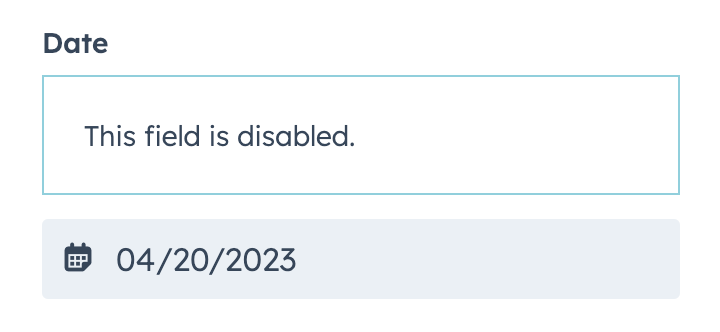 条件とメッセージは、フィールドの`disabled_controls`オブジェクトで設定されます。フィールドを編集可能にするための条件は、`rules`オブジェクト内で設定され、[advanced\_visibility](#field-visibility)と同じ形式に従います。
以下のコードは、`rules`基準の単純な実装と高度な実装の両方を示しています。
* `simple_page`フィールドには、`text_field`が`testing`に設定されている場合にフィールドを無効にするロジックが含まれています。
* `fancy_page`フィールドには、`text_field`または`text_field_2`のいずれかがそれぞれ`testing`と`testing2`に等しくない値に設定されている場合にフィールドを無効にするロジックが含まれています。
```json theme={null}
// example fields.json
[
{
"type": "text",
"name": "text_field",
"label": "Text field"
},
{
"type": "text",
"name": "text_field_2",
"label": "Text field 2"
},
{
"type": "page",
"label": "Simple Page",
"name": "simple_page",
"disabled_controls": {
"message": "This field is disabled",
"rules": {
"criteria": [
{
"controlling_field_path": "text_field",
"operator": "EQUAL",
"controlling_value_regex": "testing"
}
]
}
}
},
{
"type": "page",
"label": "Fancy Page",
"name": "fancy_page",
"disabled_controls": {
"message": "This field is disabled",
"rules": {
"boolean_operator": "OR",
"criteria": [
{
"controlling_field_path": "text_field",
"operator": "NOT_EQUAL",
"controlling_value_regex": "testing"
},
{
"controlling_field_path": "text_field_2",
"operator": "NOT_EQUAL",
"controlling_value_regex": "testing2"
}
]
}
}
}
]
```
| パラメーター | タイプ | 説明 |
| ------------------------- | ------ | ------------------------------------------------------------------------------------------------------------------------------------------------------------------------------------------------------------------------------------------------------------------ |
| `message` | 文字列 | フィールドが無効な場合にコンテンツエディターに表示するメッセージ。 |
| `rules` | オブジェクト | フィールドの編集を有効にするための条件。 |
| `criteria` | 配列 | フィールドを表示するために満たす必要がある基準を定義する条件オブジェクトの配列。この配列には、`boolean_operator`パラメーターを使用して`AND`または`OR`ロジックで区切られた複数の条件オブジェクトを含めることができます。 |
| `boolean_operator` | 文字列 | 条件付き基準のブール演算子。`AND`または`OR`のいずれかにできます。指定しなかった場合、デフォルトで`AND`になります。 |
| `controlling_field_path` | 文字列 | 表示条件を制御するフィールドのドットパス。
条件とメッセージは、フィールドの`disabled_controls`オブジェクトで設定されます。フィールドを編集可能にするための条件は、`rules`オブジェクト内で設定され、[advanced\_visibility](#field-visibility)と同じ形式に従います。
以下のコードは、`rules`基準の単純な実装と高度な実装の両方を示しています。
* `simple_page`フィールドには、`text_field`が`testing`に設定されている場合にフィールドを無効にするロジックが含まれています。
* `fancy_page`フィールドには、`text_field`または`text_field_2`のいずれかがそれぞれ`testing`と`testing2`に等しくない値に設定されている場合にフィールドを無効にするロジックが含まれています。
```json theme={null}
// example fields.json
[
{
"type": "text",
"name": "text_field",
"label": "Text field"
},
{
"type": "text",
"name": "text_field_2",
"label": "Text field 2"
},
{
"type": "page",
"label": "Simple Page",
"name": "simple_page",
"disabled_controls": {
"message": "This field is disabled",
"rules": {
"criteria": [
{
"controlling_field_path": "text_field",
"operator": "EQUAL",
"controlling_value_regex": "testing"
}
]
}
}
},
{
"type": "page",
"label": "Fancy Page",
"name": "fancy_page",
"disabled_controls": {
"message": "This field is disabled",
"rules": {
"boolean_operator": "OR",
"criteria": [
{
"controlling_field_path": "text_field",
"operator": "NOT_EQUAL",
"controlling_value_regex": "testing"
},
{
"controlling_field_path": "text_field_2",
"operator": "NOT_EQUAL",
"controlling_value_regex": "testing2"
}
]
}
}
}
]
```
| パラメーター | タイプ | 説明 |
| ------------------------- | ------ | ------------------------------------------------------------------------------------------------------------------------------------------------------------------------------------------------------------------------------------------------------------------ |
| `message` | 文字列 | フィールドが無効な場合にコンテンツエディターに表示するメッセージ。 |
| `rules` | オブジェクト | フィールドの編集を有効にするための条件。 |
| `criteria` | 配列 | フィールドを表示するために満たす必要がある基準を定義する条件オブジェクトの配列。この配列には、`boolean_operator`パラメーターを使用して`AND`または`OR`ロジックで区切られた複数の条件オブジェクトを含めることができます。 |
| `boolean_operator` | 文字列 | 条件付き基準のブール演算子。`AND`または`OR`のいずれかにできます。指定しなかった場合、デフォルトで`AND`になります。 |
| `controlling_field_path` | 文字列 | 表示条件を制御するフィールドのドットパス。 このファイルを作成するには、まず、次の[CLIコマンド](/developer-tooling/local-development/hubspot-cli/reference#generate-theme-field-selectors-for-in-app-highlighting)を実行してファイルを生成します。ファイルの生成中にスクリプトが実行されて、初期フィールド セレクター マッピングが設定されます。
```shell theme={null}
hs theme generate-selectors
このファイルを作成するには、まず、次の[CLIコマンド](/developer-tooling/local-development/hubspot-cli/reference#generate-theme-field-selectors-for-in-app-highlighting)を実行してファイルを生成します。ファイルの生成中にスクリプトが実行されて、初期フィールド セレクター マッピングが設定されます。
```shell theme={null}
hs theme generate-selectors